
Figure 2.
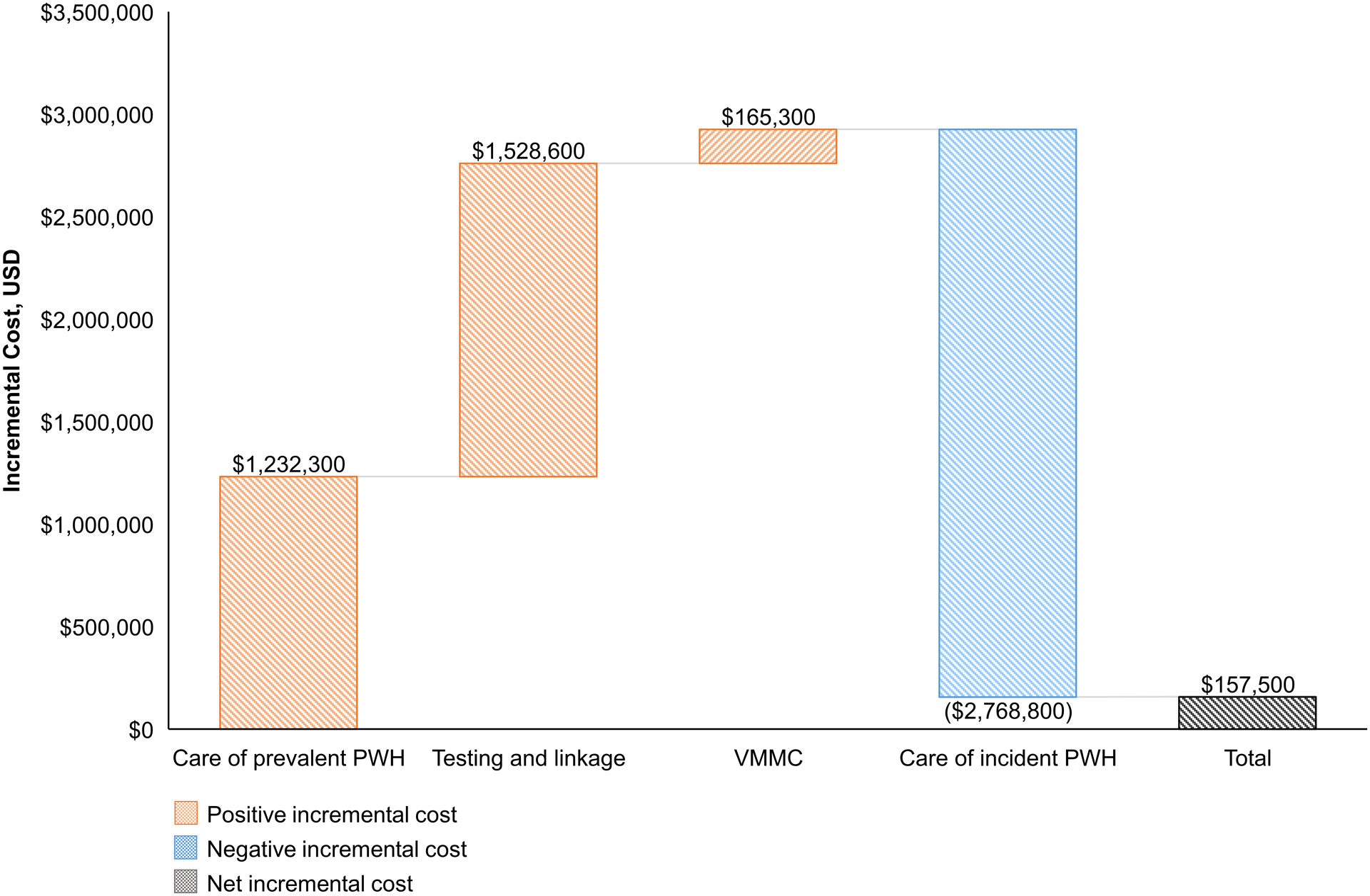
Cost breakdown of the incremental cost of the CP intervention.
This waterfall chart reports the positive and negative incremental costs (y-axis) of each component (x-axis) of the CP intervention arm compared to the standard of care arm. Positive incremental costs are represented in orange, negative incremental costs in blue, and total or net incremental costs in grey. Exact cost values appear above or below the corresponding bar.
CP, combination prevention; SOC, standard of care; PWH, people with HIV; VMMC, voluntary male medical circumcision.