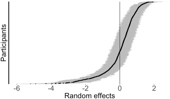
Figure 4.
Plot of the random effect of the participant on total day pain scores estimated from the multilevel model (N=1009). Y-axis represents the range of estimated average pain scores for each participant. Each black dot represents one participant’s mean (ie, random intercept), grey lines indicate 95% CIs. Distribution of points across the x-axis indicates large variability across individuals (ie, between-group variance), and the grey lines indicate the within-person variability in daily scores over time.

