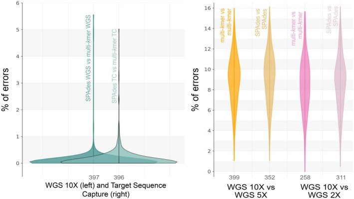
FIGURE 6.

Kernel density of the percentage of error per locus, averaged across species. Percentage of error was calculated from the mismatches and alignment lengths in the blast results. (a) Comparisons between spades and our multi‐kmer abyss approach, showing the density of the average percentage of error in assembly strategy (same data set, different assembly approach); WGS indicates our whole genome sequence data set with 10× average depth of coverage and TC indicates the target sequence capture data set. (b) Comparisons showing the density of the average percentage of error from comparing the same assembly approach but different coverages. Multi‐kmer indicates the multi‐kmer abyss approach. In each density graph, the term before “vs” indicates the subject and the term after “vs” indicates the query. Numbers under each density graph indicate the average number of loci aligned per species in the blast alignments. Graphs show that the percentage of errors tend to increase when using reduced read coverage, regardless of the used assembly strategy
