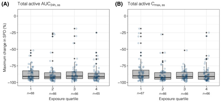
FIGURE 3.

Maximum change from baseline in SPD stratified by quartiles of total active AUC24h,ss (A) or Cmax,ss (B). The numbers below the categories on the x‐axis indicate the number of patients in each category. Open circles show the individual data. The ends of the box are the lower and upper quartiles, the middle line shows the median. The whiskers indicate 1.5 × interquartile range. Data above/below the whiskers are shown as asterisks. AUC24h,ss, area under the plasma concentration–time curve from time 0 to 24 hours (2 dosing intervals) at steady‐state; Cmax,ss, maximum concentration at steady‐state; SPD, sum of the products of the greatest diameters; total active, acalabrutinib + ACP‐5862 exposure adjusted for molecular weight, potency and protein binding
