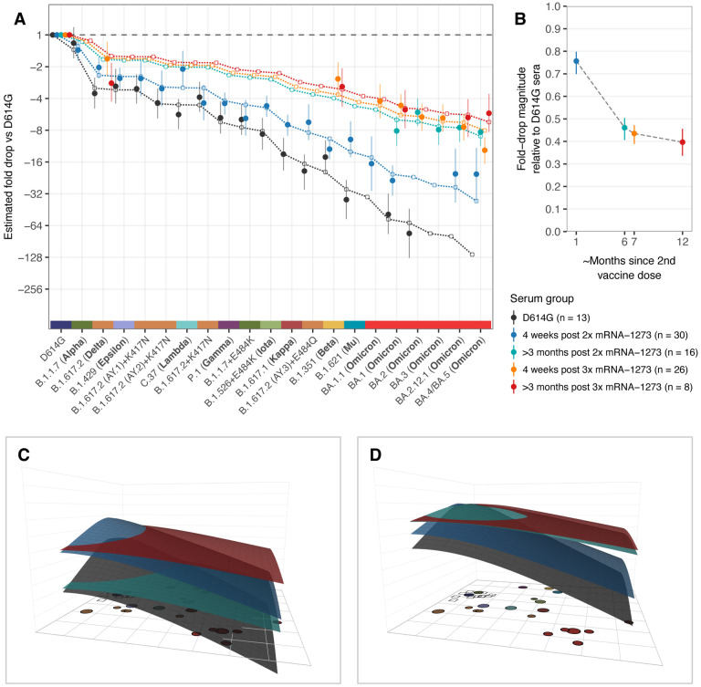
Fig. 2. Comparison of fold-drops to different variants in post D614G infection and post mRNA-1273 vaccination sera.
A) Comparison of different estimates of titer fold-drop responses against different variants. Solid points show the estimate for the mean fold drop compared to the titer for D614G, while lines represent the 95% highest density interval (HDI) for this estimate. The points for D614G to the left of the plot represents the homologous virus against which fold-change for other strains was compared and are therefore fixed at 1. Dotted lines and outline circles show estimates based on a model that assumes a shared overall pattern of fold-drops but estimates “slope” differences in the rate of reactivity drop-off seen in the 4 serum groups, as described in Materials and Methods, “Calculating fold-drop differences in vaccine sera”. To aid comparison, points and lines for each of the serum groups have some offset in the x-axis. B) Estimates of fold-drop magnitudes for each mRNA-1273 serum group, relative to the fold-drops seen in the D614G convalescent serum group. Lines show the 95% HDI for each of the estimates and the position on the x axis is proportional to the number of months since 2nd vaccine dose, assuming an average of 6 months for sera in the >3 months post 2x mRNA-1273 and >3 months post 3x mRNA-1273 groups. C) Antibody landscapes showing how estimates of the mean titer for each of the serum groups in panel A vary across antigenic space. D) Antibody landscapes as shown in C but fixed to have the same peak titer (2560) against the D614G variant in order to visualize differences in the slope of the titer drop-off based on a fixed magnitude of response. Interactive versions of the landscapes shown in panels C & D are accessible online at https://acorg.github.io/mapping_SARS-CoV-2_antigenic_relationships_and_serological_responses.

