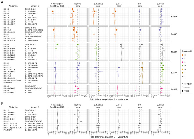
Fig. 6. Effect of pairwise amino acid differences on reactivity to different serum groups.
This plot compares the average fold difference in titer between A) different pairs of variants that differ by only a single amino acid difference in the RBD, or B) that do not differ by any amino acids in the RBD, but differ in the NTD. Comparisons are grouped by serum group (panel columns) and corresponding RBD difference (panel rows). In each panel the circle represents the estimate for the average fold difference in titer between variant A and variant B, as named on the left-hand side of the plot, while lines extend to indicate 95% highest density interval (HDI) for this estimate. The black dashed line marks a fold difference in titer of 1 (no difference), while the colored dashed line indicates the average fold difference between all pairs of variants with that substitution in the RBD. Points and lines are colored according to the amino acid in the variant homologous to that serum group, at the position in the RBD where the pair of variants compared differ. Filled circles indicate where pairs of variants had no additional amino differences in the NTD region, often because one was generated as an artificial mutant. In contrast, open circles indicate pairs of variants with additional amino acid differences in the NTD region, in addition to the RBD amino acid difference listed. The estimate for B.1.617.2 sera fold differences between the B.1.617.2 and B.1.617.2 (AY.3)+E484Q variants (panel A 3rd column, 2nd row), which falls outside the plot, is −59.4 (95% HDI −117.1, −30.7). Details of how fold-difference estimates and highest density intervals were calculated are described in Materials and Methods. Figure S30 shows the same results against an expanded set of pairwise amino acid differences. Interactive scatterplots comparing titers against each pair of variants for each serum group are available online at https://acorg.github.io/mapping_SARS-CoV-2_antigenic_relationships_and_serological_responses.

