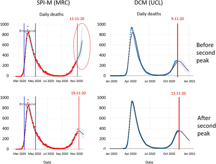
Figure 4.
Predicting the second peak: The left panels show the forecasts from the MRC Biostatistics Unit at the University of Cambridge, UK, shortly before and after the peak of a second surge. These projections were taken as screen grabs from the dashboard on appropriate days. The right panels show the equivalent predictions using dynamic causal modelling. The top row shows the predictions before the second peak, while the bottom row shows the equivalent predictions a few days later. The dates are indicated by the vertical red lines. The red ellipse highlights an example of overfitting recent trends in the data.

