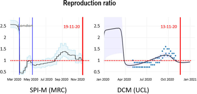
Figure 6.
Estimates of the reproduction ratio from the MRC Biostatistics Unit (left panel) and dynamic causal modelling (right panel). The black lines correspond to the best (posterior) expectations and the shaded area correspond to credible intervals. The blue dots superimposed over the dynamic causal modelling estimates report the ranges of consensus values reported by the government22. These have been plotted 2 weeks before the end date of the reporting period for each pair. The vertical red lines indicate the date of estimation in mid-November.

