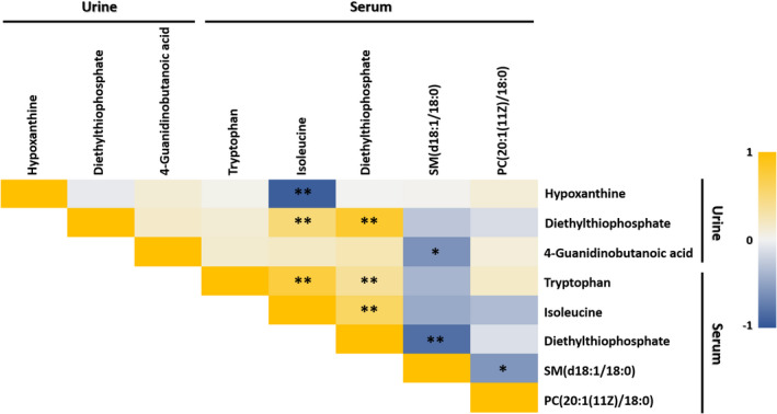
FIGURE 1.

Heat map of correlations amongst all selected potential metabolomic biomarker candidates. Spearman's correlation heat map showing the correlation amongst all selected potential metabolomic and lipidomic biomarkers. Colour intensity represents the magnitude of correlation. Red represents positive correlations, and the green represents negative correlations. * p < 0.05; ** p < 0.01
