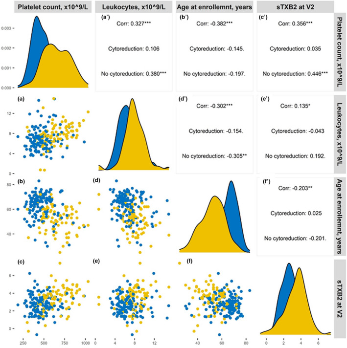
Figure 2.

Correlogram plot of variables influencing residual sTXB2. The figure represents the mutual correlation of all those variables associated with sTXB2 at univariate analysis. In each panel, data from patients on cytoreduction are shown in yellow and data on non‐cytoreduced patients are shown in blue. The legends for the x axes are reported in the upper line, the legends for the y axis are reported on the left. The panels on the diagonal line represent the frequency histograms (from the upper left to the bottom right panel: platelet count, leukocyte count, age at enrollment, and sTXB2, respectively). The panels a–f represent reciprocal bivariate scatterplots (lower left corner of the figure) and the corresponding Pearson correlation (rho) coefficients for the all, cytoreduced and non‐cytoreduced cohorts are reported in the panels a′–f′ (upper right corner). For instance, a presents the scatterplot of platelet count (x‐axis) vs. sTXB2 (y‐axis) and a′ reports the corresponding rhos. *P < 0.05; **P < 0.001; ***P < 0.0001.
