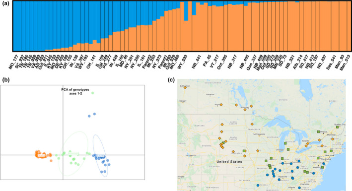
FIGURE 4.

Population structure of the accessions. (a) structure results for genetic variation at K = 2 for 85 individuals representing 56 provenances. The coloured plot represents the estimates of Q (the estimated proportion of an individual's ancestry from each subpopulation). From left to right, the first 18 provenances (MO_177–OH_141) we classed as “pure southern,” provenances 19–29 (IL_169–NY_373) we classed as “admixed” and provenances 30–56 (MI_293–Man_513) we classed as “pure northern.” (b) Scatter plot principal component axis one (PC1) and axis two (PC2) based on genotype data of 85 samples. The x‐axis is PC1 and explained 10.8% of the variation and y‐axis is PC2 and explained 1.6% of the variation. Samples were coloured according to structure results. Orange, blue and green represent the “pure northern,” “pure southern” and “admixed” sets of individuals, respectively, from structure analysis (i.e., Q). (c) Geographical distribution of the seed source provenance locations of the trees, with each location labelled with the same colouring scheme as in (b)
