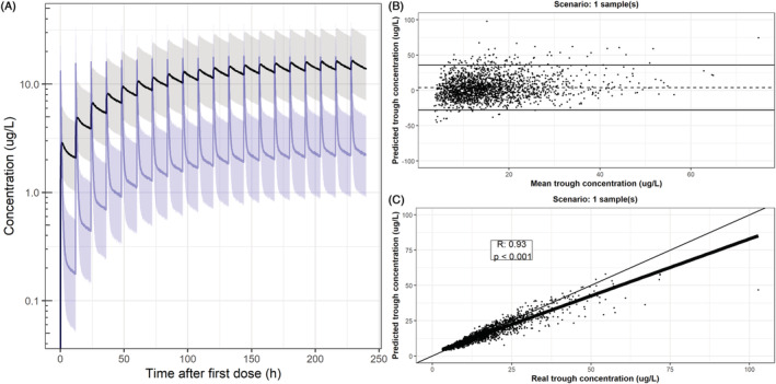
FIGURE 2.

Population prediction (80% prediction interval) in simulation cohort and visualization of predictive capability based on one saliva sample at steady state. (A) Median population prediction (solid lines) and 80% prediction interval of the simulation cohort (n = 2000) in plasma (black) and saliva (blue). (B) Proportional bias in the prediction (dotted line) and proportional limits of agreement (solid lines) of predicted C trough during steady state after Bayesian optimization based on a single saliva sample 11.5 h post‐dose (during steady state). The x axis displays the mean of the predicted and real C trough and the y axis displays the proportional difference between the predicted and real C trough. (C) Pearson correlation between true and predicted plasma C trough of the scenario displayed in B. The bold black line represents the regression line, the thin black line represents the line of unity and each dot represents a simulated subject. For proportional bias plots and linear correlations of all scenarios, please refer to Supporting Information Figures S3 and S4
