
Figure 2.
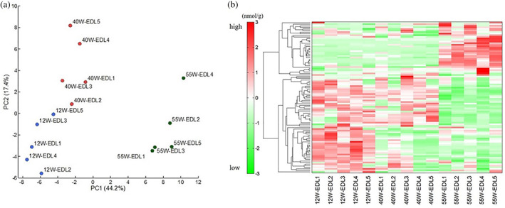
(a) Principal component analysis of metabolomic datasets of skeletal muscle from extensor digitorum longus muscle (EDL). The principal component analysis was carried out with the peak data using SampleStat version 3.14. Plots of young (blue circles), elderly (red circles) and late elderly (green circles) are clearly distinguished on the first principal component axis (x‐axis). (b) Heat map comparing metabolite changes. The heat map patterns were clearly distinguishable. Red indicates that the relative content of metabolites is high, whereas green indicates that the relative content of metabolites is low.