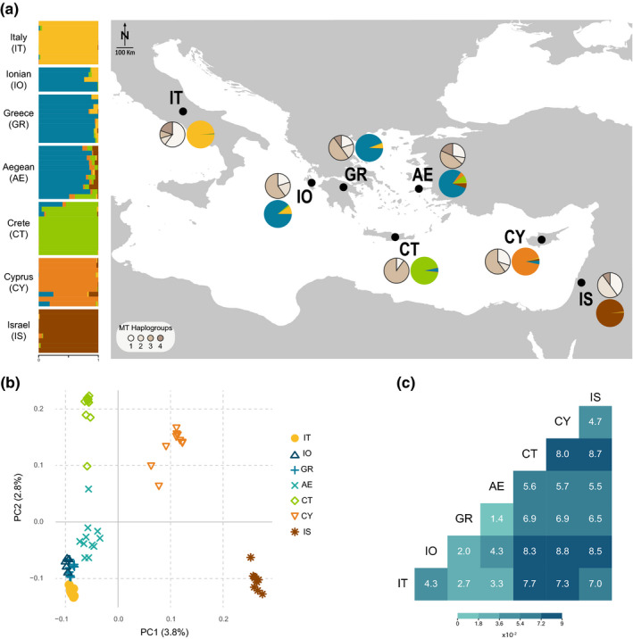
FIGURE 1.

Population structure of barn owls in the Eastern Mediterranean. (a) Nuclear and mitochondrial population structure. Horizontal bars indicate individual admixture proportions for K = 5 as determined by sNMF. Black dots on map indicate the approximate centroid of each population; coloured pie charts represent the mean admixture proportions per population; pie charts in shades of beige represent mitochondrial haplogroup proportions per population. (b) PCA based on the pruned nuclear SNP set. Values in parenthesis indicate the percentage of variance explained by each axis. (c) Pairwise FST between sampled barn owl populations. Heat map illustrates the given values according to the legend
