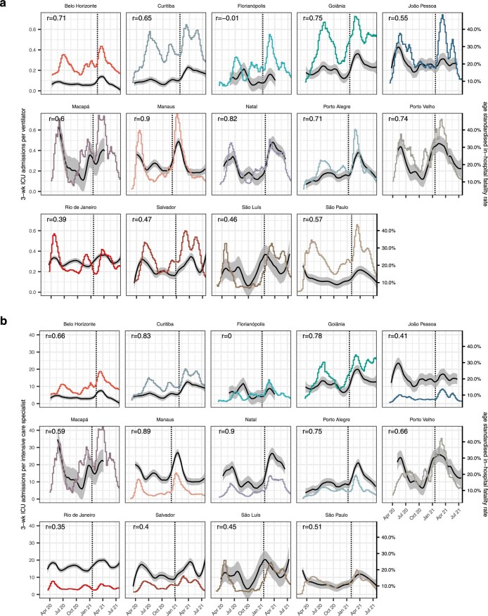
Extended Data Fig. 5. Time evolution of pandemic healthcare pressure indices, part 2.
ICU admissions in this and the following two weeks per hospital resource are shown in colour, with y-axis on the left. In (a), demand per ventilator is shown, and in (b) demand per intensive care specialist. Non-parametric mean estimates of age-standardised COVID-19 in-hospital fatality rates are shown in black, with 95% confidence intervals as grey ribbons, and y-axis on the right. Pearson correlation coefficients (r) are shown in the upper left corner, and dates of Gamma’s first detection as vertical lines.

