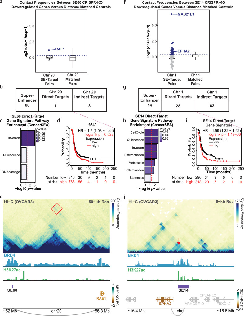
Fig. 6. Hi-C analysis detects direct targets of SE60 and SE14 supporting direct roles in invasion, differentiation, and metastasis.
a Distribution of Hi-C counts (contact frequency) between SE60 downregulated cis-genes and the SE60 locus (left) (n = 4), blue points/genes are direct targets. Distribution of Hi-C counts of a background set of 100 distance-matched gene sets (right) (n = 400). The dashed line denotes the cutoff for direct target genes in the experimental sample. b Table displaying the number of direct and indirect cis-target genes of SE60 determined by Hi-C. c CancerSEA analysis of the direct target (p-values determined by GSVA followed by Spearman’s FDR corrected rank test). The red line denotes a p-value of 0.05. d Kaplan–Meier plot of RAE134,35. The red line denotes patients with high expression of RAE1, significant p-values are denoted in red. e Hi-C contact heatmap showing the interaction between RAE1 and the SE60 locus (red square). The colored gene names correspond to the fold change of significantly affected genes after CRISPR-KO. f Distribution of all Hi-C counts between SE14 downregulated cis-genes and the SE14 locus (left) (n = 90), blue points/genes are direct targets. Distribution of Hi-C counts of a background set of 100 distance-matched control gene sets (right) (n = 9000). The dashed line denotes the cutoff for direct target genes. g Table displaying the number of direct and indirect cis-target genes of SE14 determined by Hi-C. h CancerSEA pathway analysis of the SE14 direct targets (p-values determined by GSVA followed by Spearman’s FDR corrected rank test). The red line denotes the metric for a p-value of 0.05. i Kaplan–Meier plot of the SE14 direct target genes34,35. Significant p-values are denoted in red. j Hi-C contact heatmap showing the interaction between EPHA2 and the SE14 locus (red arrow). The colored gene names correspond to the fold change of significantly affected genes after CRISPR-KO. Box plots in a and f are centered on the median, with the bounds of the box being the IQR. The minimum and maximum values, after disregarding outliers, are represented by the upper and lower whiskers. Source data are provided as a Source Data file.

