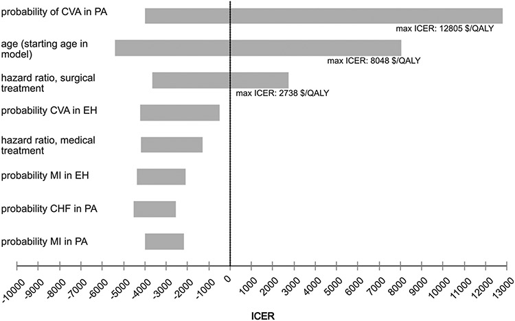
Fig 2.
Tornado diagram.The tornado diagram is a composite representation of multiple univariate sensitivity analyses. Here the 8 inputs with the greatest effect are shown. Only 3 variables produced an ICER in univariate analysis. These are labeled with the maximum ICER produced along each variable’s range. CHF, congestive heart failure; CVA, cerebrovascular accident; EH, essential hypertension; ICER, incremental cost-effectiveness ratio; MI, myocardial infarction; PA, primary aldosteronism.

