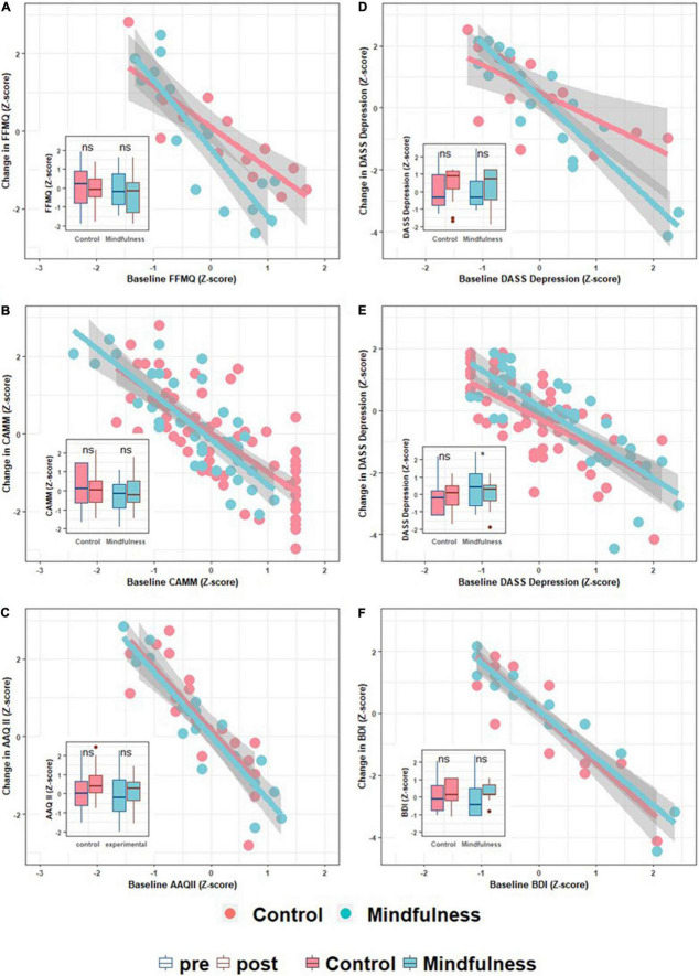
FIGURE 1.
Scatter and boxplots depicting intervention effects. In the scatter plots, the x-axis represents the baseline value for a specific variable, while the y-axis represents its change (Δ) post intervention. The first column of the panel plots (A–C) are mindfulness-related variables, while the second (D–F) are psychopathology severity scores. Each row refers to a different sample. The first row is the Psychosis-MBCT sample (A,D), the second row is the School-MiSP sample (B,E), and the last row corresponds to the University-MBCT sample (C,F). All plots are complemented by a boxplot inset depicting group pre- and post-intervention changes. This allows us to present both the participants’ trajectories (scatter plots) and the common group-based analytic approach (contrasting averages).

