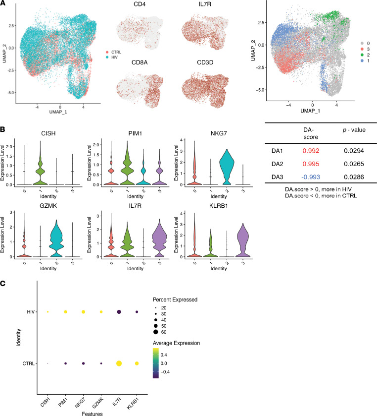
Figure 3. Differential abundance analysis of CSF T cells.
(A) Left, UMAP projection of CSF T cells from PWH (blue) and uninfected controls (CTRL; red). Right, cells are colored if they belong to a region that is DA in PWH compared with CTRL. Identities 1 and 2 are DA regions that were found more frequently in PWH, and identity 3 is the DA region that was found less frequently in PWH compared with uninfected controls. Cells colored gray are not in DA regions. (B) Violin plot showing expression of genes that distinguish the DA regions from all other T cells. (C) Dot plot showing average expression of DA T cell marker genes in the CSF T cells of PWH compared with uninfected controls. The size of the dot corresponds to the percentage of cells expressing the gene. The color represents the average expression level. n = 5 PWH and n = 4 uninfected controls.

