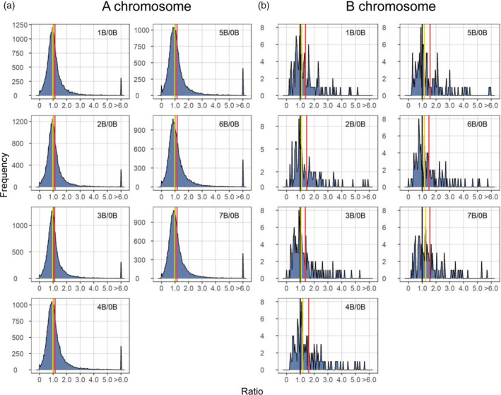
Figure 1.

Ratio distributions of gene expression in each experimental genotype compared with the control. (a) Ratio distributions of A‐located genes. (b) Ratio distributions of B‐located genes with outliers (ratio > 6 or < 1/6) removed. Normalized read counts for each gene were averaged across biological replicates and were then used for the generation of ratios comparing each experimental group to the control. Gene ratios for each comparison were plotted on the x‐axis with a bin width of 0.05. The y‐axis denotes the number of genes per bin (frequency). A ratio of 1.00 represents no change in the experimental genotype versus the control and is labeled with vertical lines in black. The mean and median of ratios were computed and demarcated with labeled vertical lines in red and yellow, respectively.
