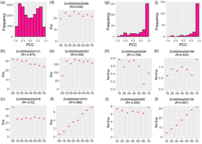
Figure 3.

Gene expression level and its Pearson correlation coefficient (PCC) representing B‐dosage sensitivity. (a, g, j) Histogram of PCCs between the expression level of A‐located (a) or B‐located (g, j) genes and the B copy number. (a, g) The PCC for each gene was computed by comparing normalized read counts averaged across all biological replicates for each genotype (gene expression level of 0B to 7B) to the B copy number (0–7). Then the PCC for each gene was plotted into a histogram on the x‐axis with a bin width of 0.2. The y‐axis denotes the number of genes (frequency) per bin. (j) Histogram of PCC between the expression level of B‐located genes and the B copy number (1B–7B), with counts of 0B deducted from 1B–7B. (b–f) Example genes from (a) with distinct expression patterns and different values of PCC. The y‐axis shows the normalized read counts (Exp.) averaged across all biological replicates for each genotype on the x‐axis. (h, i, k, l) Example genes from (j) with distinct expression patterns and different values of PCC. The y‐axis denotes the expression level relative to 0B (Rel. Exp.) averaged across all biological replicates for each genotype on the x‐axis. The label indicates the gene locus and its PCC value (R).
