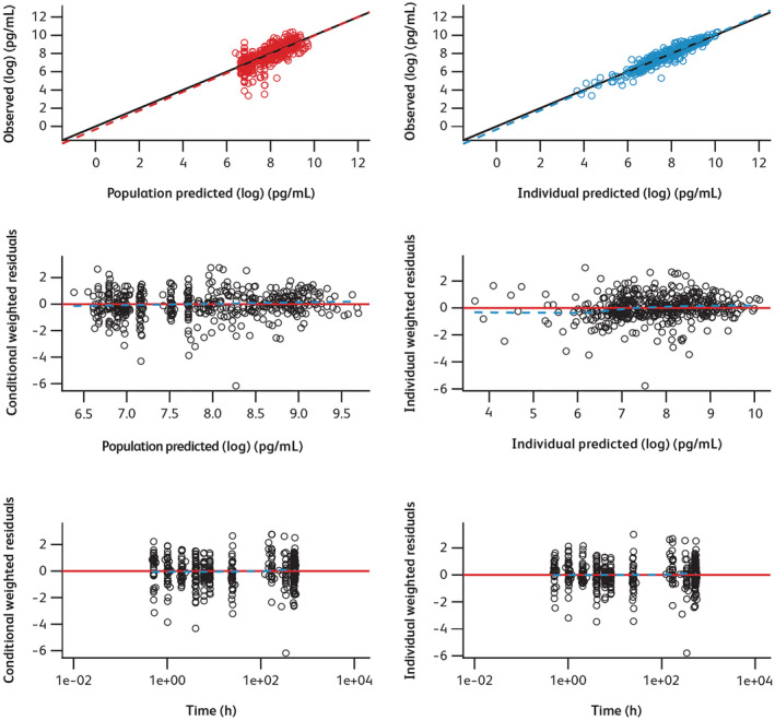
FIGURE 1.

Diagnostic plots for final model. Time, time after the first dose. In the plots of log‐transformed observed values versus log‐transformed predicted values, circle points represent individual data points; the solid line and dotted line show the reference line (diagonal line) and linear regression line based on the individual data points, respectively. In the scatter plots of residuals, black circle points represent individual data points; the red solid line and blue dotted line show the reference line (y = 0) and the smooth line using locally weighted polynomial regression, respectively
