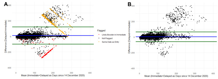
Figure 2.
Bland–Altman plot comparing immediate self-report and delayed self-report of COVID-19 vaccination. Blue line represents the mean difference and green lines represent the 90% agreement interval around the mean difference. (A) represents data prior to cleaning identifying likely entry errors. (B) represents the data after removing participants with identified errors.

