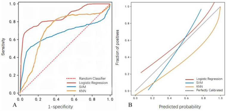
Figure 4.
Model performance using the validation dataset. (A) The ROC curve of the logistic regression, SVM, and KNN models. (B) Calibration curves of the EVD-associated infection prediction. The y-axis meant the diagnosed infection. The x-axis meant the predicted risk of infection. The diagonal dotted line meant a perfect prediction by an ideal model. The solid line represented the performance of logistic regression, SVM, and KNN models, which indicated that a closer fit to the diagonal dotted line represented a better prediction.

