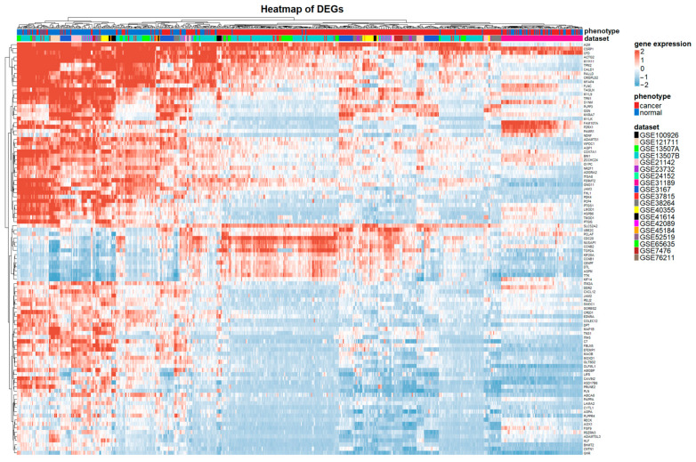
Figure 3.
Heatmap plot of the top 100 DEGs between BCa and control samples in the merged meta-dataset. Blue and red represent relative downregulation and upregulation, and white represents no significant change in gene expression. Horizontal and vertical axes are clustered by genes and samples, respectively.

