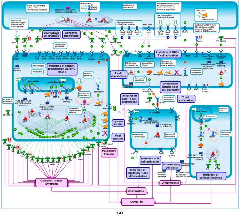
Figure 4.
COVID-19 immune dysregulation. (a) A node (or object) on the map could be a gene, protein or chemical compound. Query genes from experimental data which intersect with pathway objects are denoted by thermometers. Thermometer 1 represents DEGs in response to treatment with vaccine, applying thresholds of 5 and −5 on log2FC and FDR ≤ 0.05, respectively. Thermometer 2 represents DEGs in response to treatment with vaccine, applying thresholds of 2 and −2 on log2FC and FDR ≤ 0.05, respectively. (b) Direct interactions network map between DEGs enriching COVID-19 immune dysregulation pathways. Connections between network objects on the map are referred to as links (or edges). A link identifies an interaction or a logical relation between two nodes. The type of interaction or relation is reflected by an appropriate symbol placed in the middle of the link. B = binding; IE = influence on expression; TR = transcription regulation; red arrows = inhibition; green arrows = activation; grey arrows = unspecified action; light violet text box = normal process; pink text box = pathological processes; white text box with blue outline = notes; starred network objects = groups or complex processes; red thermometers on pathway map = network object is upregulated by vaccine; blue thermometers on pathway map = network object is downregulated by vaccine. The length of red and blue bars in the thermometers represent log2FC values (longer red bars represents larger upregulation of gene expression and longer blue bars represent larger downregulation of gene expression). Red circles on process network = network object is upregulated by vaccine; blue circles on process network = network object is downregulated by vaccine. Darker red circles indicate larger upregulation, darker red circles indicate larger downregulation.


