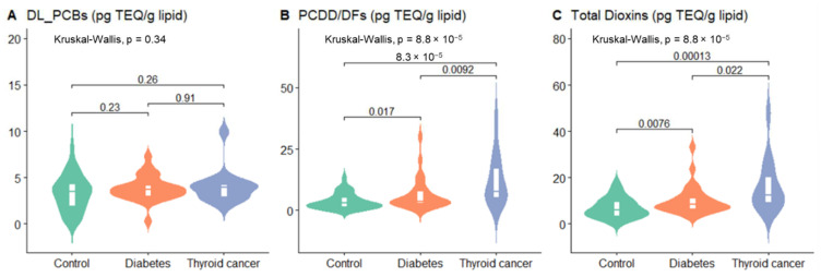
Figure 1.
Serum concentrations for PCDD/DFs, DL-PCBs of the study group. Violin plots show differences in blood of concentrations for DL_PCBs (A), PCDD/DFs (B), total dioxins (C) at the controls group (n = 55), type 2 diabetes (n = 30) or thyroid cancer (n = 15). The line in the white box represents the median. The width of the shape represents blood concentration density, and the length illustrates the range of the blood concentration.

