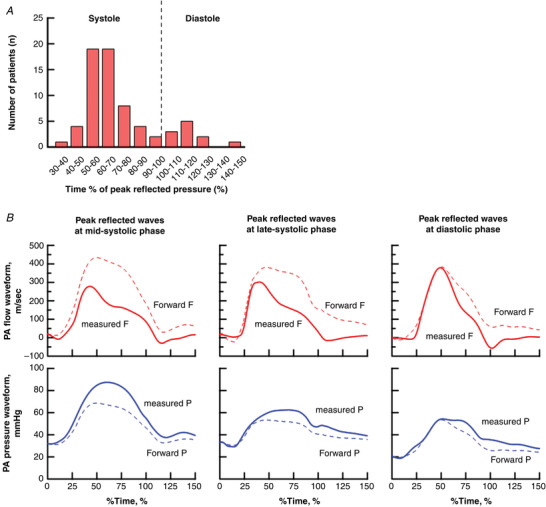
Figure 3. The distribution of reflected wave arrival times (A) and representative examples (B).

A, distribution of arrival time of peak reflected waves over total study population in the treatment‐naive condition (n = 68). B, representative flow (top) and pressure (bottom) waveforms with peak reflected waves at mid‐systolic phase (left), late‐systolic phase (middle) and diastolic phase (right). Solid curves present the measured flow or pressure waveform. Dotted curves present forward flow or pressure waveform. Difference between forward and measured waveform present the reflected waveform. The x‐axis is given by the time of peak reflected wave (% of systole). [Colour figure can be viewed at wileyonlinelibrary.com]
