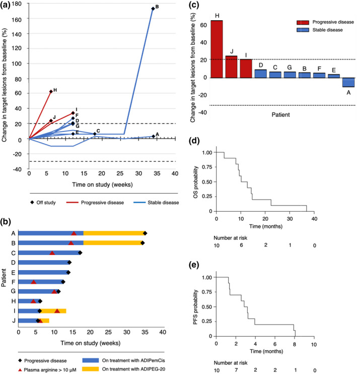
FIGURE 1.

(a) Spider plot showing the percentage change in the sum of the target lesion diameters over time. (b) Swimmer plot showing time on treatment with ADIPemCis and ADI‐PEG20, time to raised plasma arginine levels and time to progression. (c) Waterfall plot showing the best percentage change in the sum of the target lesion diameters. (d) Kaplan–Meier analysis of overall survival (OS) in all patients. (e) Kaplan–Meier analysis of progression‐free survival (PFS) in all patients
