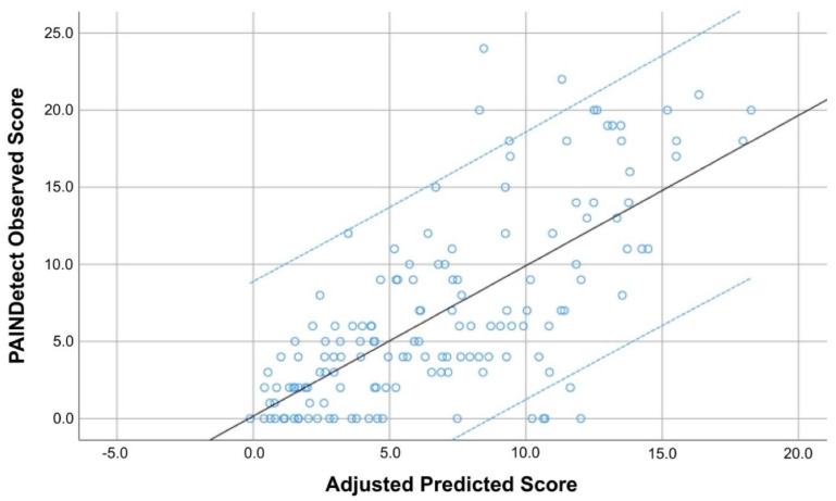
Figure 2.
Scatter plot of the adjusted predicted score (r2 adjusted: 0.512) explaining the PainDETECT score in COVID-19 survivors with post-COVID pain symptoms (n = 146). Note that some points can be overlapping. Black line represents de mean predicted score whereas the blue lines represent the 95% confidence intervals.

