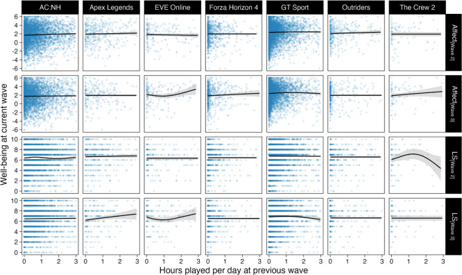
Figure 3.
Scatterplots of well-being scores and hours played at the previous wave. Points are individual participants' data, and lines and shades are model fits and 95% CIs from exploratory generalized additive models with penalized cubic splines. The x-axis is truncated at 3 hours per day for this figure for clarity.

