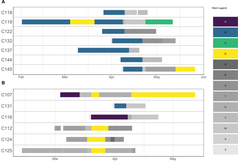
Appendix 1—figure 1. Ward movements for patients involved in a cluster.
Each row corresponds to a patient, and the solid lines indicate hospitalisation dates. The lines are coloured according to which ward a patient was in on a particular day. Outbreak wards (A–D) are coloured differently from non-outbreak wards (Q–Z).

