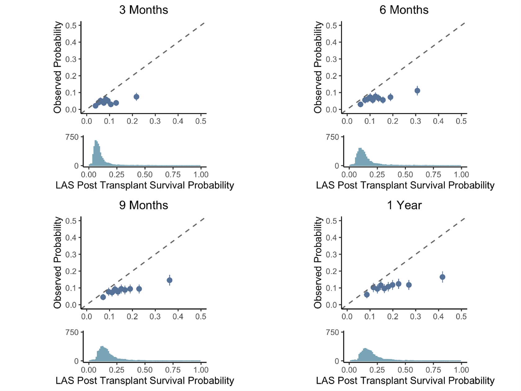
Figure 5:

Calibration of the LAS Post Transplant Survival Probability at predicting 3-month (top left), 6-month (top right), 9-month (bottom left), and 1-year (bottom right) survival. Patients are sorted into deciles, and each dot represents one decile. The x-axis represents the average predicted probability of death or re-transplant over each decile, while the y-axis shows the observed proportions (with standard errors) of death or re-transplant in each decile. The dotted line represents ‘perfect calibration’, where the predicted probabilities of death match the observed percentages. The density plot below each scatter plot shows the distribution of predicted probabilities of death or re-transplant for each model.
