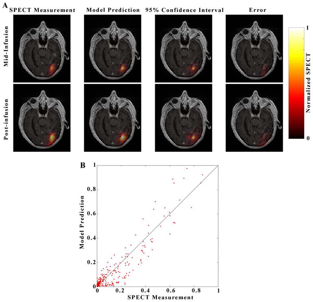
Figure 5. Visualization of the Model 12 prediction for a representative patient.

Visualization For each image in panel A, each image consists of a heatmap of the model prediction is overlaid over of a grayscale post-contrast T1-weighted image through the central axial tumor slice for patient 5. Images in the top row correspond to the mid-infusion time point, and images in the bottom row correspond to the post-infusion time point. The left-most column depicts the true distribution of RNL within the central tumor slice, the second column the mean of 100 model predictions, the third column 95% confidence interval, and right-most column the absolute value of prediction error. A strong degree of overlap between the predicted and measured RNL distribution resulted in a Dice value of 0.84. The predicted voxel-wise values of RNL are plotted against the measured values in Panel B with the line of unity shown in black. A high level of agreement at the voxel level resulted in a CCC of 0.96.
