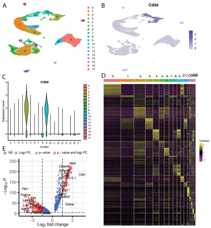
Figure 2.
Common visualization approaches for scRNAseq data. In this example, intratumoral CD45+ immune cells isolated from orthotopic liver tumors in a rat model of hepatocellular carcinoma were sequenced using the 10X Genomics platform. Visualizations were created using the Seurat [204] and EnhancedVolcano [205] packages in R (R Foundation). (A) A common ‘first’ step in analyzing scRNAseq data is to discretize the cells in either a supervised or unsupervised manner into clusters of cells with similar expression patterns. These clusters can then be visualized in a t-distributed stochastic neighbor embedding (t-SNE) map where the relative similarity in expression patterns between cells is depicted in their relative proximity on a 2- or 3-dimensional diagram. (B) Feature maps allow for the visualization of specific genes or gene sets across the t-SNE map. In this case, the expression of the Cd3d gene was closely correlated with clusters 4 and 9, indicating that these clusters are comprised of T lymphocytes. (C) Another method to readily visualize the expression of genes or gene sets across clusters is with violin plots. (D) Heat maps are a common method to visualize differentially expressed genes across a group of samples or cell clusters. (E) The statistical significance as well as the magnitude of differentially expressed genes can be visualized simultaneously on volcano plots.

