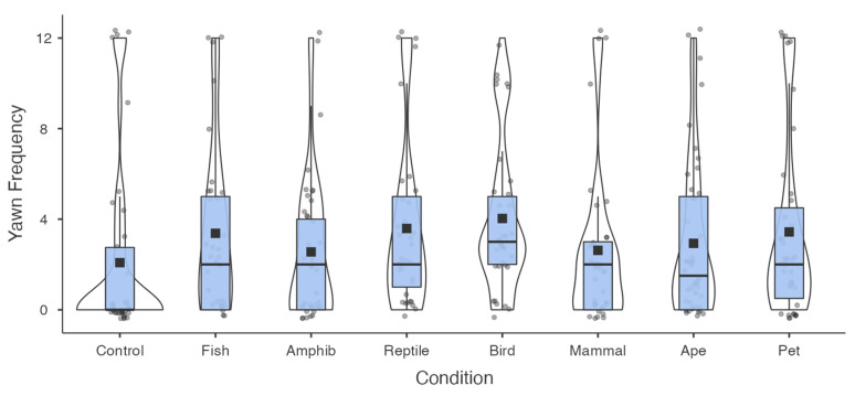
Figure 2.
Box and violin plots depicting the frequency of contagious yawning across conditions. Box plots represent the median, interquartile ranges, and the whiskers extend 1.5 times the interquartile range for the upper and lower boundary, while the violin plots illustrate the distribution of yawn frequency. Observed responses (grey circles) and group means (black boxes) are also represented.

