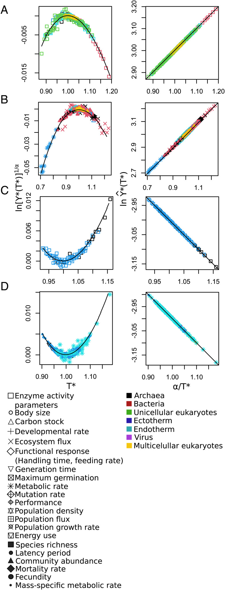
Fig. 2.
Universal patterns of temperature response predicted by Eqs. 9 and 10. (Left) The convex and concave nonlinear patterns predicted when is plotted vs. (Eq. 9) and (Right) the straight lines predicted when is plotted vs. (Eq. 10). In theory, if rescaled data collapse into a single relationship, it means that all respond to the same general law. As expected, all curves regardless of variable, environment, and taxa collapse onto a single curve when plotted in either of these ways. These rescalings explicitly show the universal temperature dependence of the data used in Fig. 1, as well as additional data from compiled studies. (A and B) Molecular (enzymatic) data exhibiting the predicted concave and convex patterns on the left, while (C and D) show corresponding concave and convex patterns for data above the molecular level. Note that there appears to be no variance in the fits to the linear predictions (Right), whereas there is significant variation in the nonlinear ones (Left). This is basically because . The value of is typically around 0.01 with a variance much smaller than 0.005. Since and is typically around 3, fluctuations in are very much smaller and consequently completely lost. The point is that the difference between what is plotted in Left vs. that in Right, namely, , is in absolute value very large [more than 10 times the value of ]; furthermore, it is almost a constant over the range of temperatures since it is logarithmic, whereas all of the temperature variation is in the much smaller term ).

