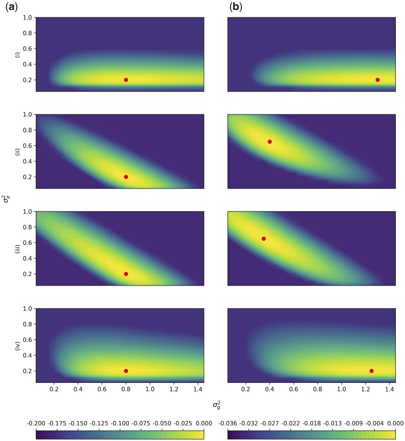
Fig. 4.
Simulation Study 2. The difference of the log-likelihood from the maximum log-likelihood is plotted for parameters on the Y-axis and on the X-axis. The colors depict the value of the difference from the maximum log-likelihood. Likelihoods are truncated at the 60% quantile of b(i) for rows (i) and (iv), and at the 60% quantile of a(ii) for rows (ii) and (iii) for visibility. Row labels correspond with Fig. 3, with (i) (ii) , (iii) , and (iv) . Column A has markers with no LD, and in column B, 10% of the markers are repeated 8 times, corresponding the rightmost points in Fig. 3. The average of 100 independent simulations using a grid with spacing 0.05 is plotted in each panel. Note that there is one color scale shared between (i) and (iv) on the left, and a different color scale shared between (ii) and (iii) on the right due to different ranges. The red point indicates the location of the maximum likelihood.

