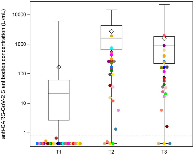
Figure 1.
Distribution of the anti-spike antibody levels at T1, T2, and T3. Distributions of the antibody titer of the 171 patients at different timepoints (T1, T2, and T3). Each box indicates the 25th and 75th percentiles. The horizontal line and the diamond inside the box indicate the median and the mean, respectively. Whiskers indicate the extreme measured values. Patients with a negative titer after the first dose (T1) are represented with different colors to identify them and evaluate their dynamics of seroconversion in T2 and T3.

