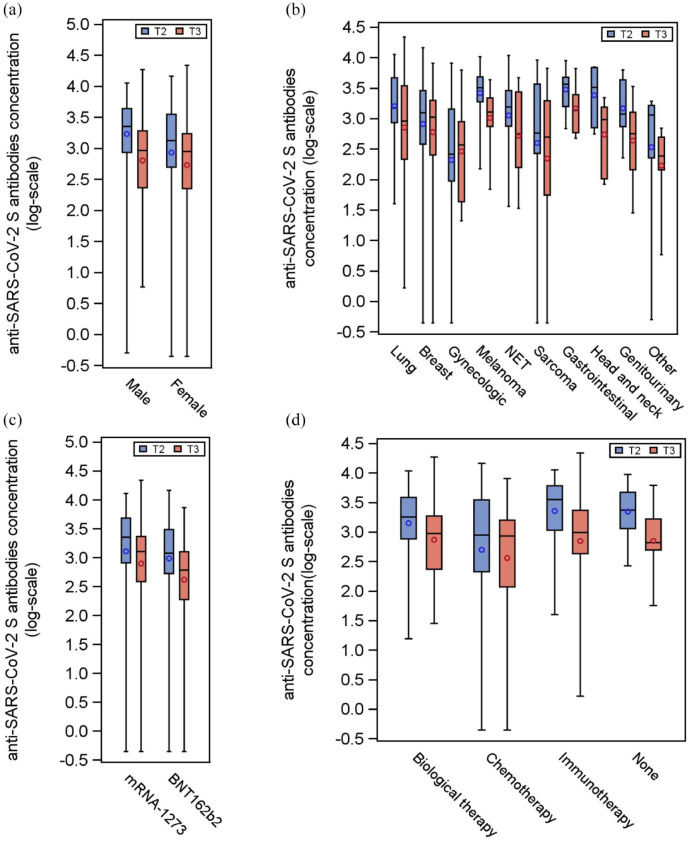
Figure 2.
Distributions of the anti-spike antibody levels at T2 and T3 according to selected variables. Distributions of the antibody titer of the 171 patients at T2 (blue box) and T3 (red box), according to sex (panel a), type of tumor (panel b), type of vaccine (panel c), and anticancer treatment class (panel d). Each box indicates the 25th and 75th percentiles. The horizontal line and the circle inside the box indicate the median and the mean, respectively. Whiskers indicate the extreme measured values.

