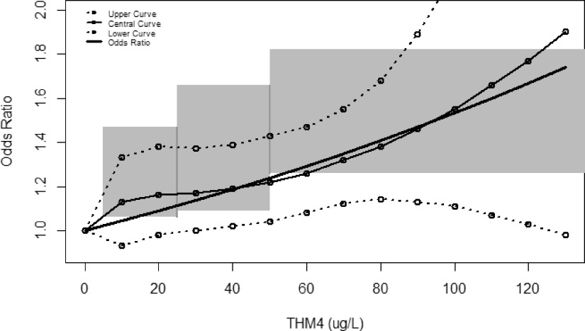
Figure 3.
Comparison of THM4 and bladder cancer epidemiological dose–response information. The slope shows the odds ratio plot from Regli et al.30; also shown is the central, upper, and lower curves from the Villanueva et al.21 pooled analysis; the shaded region is based on the lower and upper confidence intervals for the four exposure category results (males) from Costet et al.18 See Supplemental Material, “R Script of Data and Equations,” for Figure 3.

