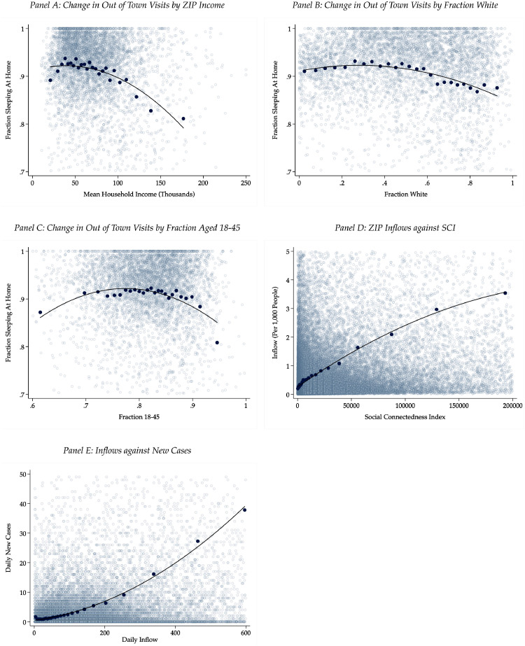
Fig. 2.
Demographic association of urban flight. Notes: Panel A shows average household income against the change in the fraction of out of town visits. Panel B repeats the exercise for the fraction who are white, and Panel C for the fraction between the ages of 18–45. Data is tract-level and shown only for New York City, San Francisco, Los Angeles, Washington DC, Seattle, and Boston. Out of town visits are winsorized at the 5% level. All demographic variables are left un-winsorized, with the exception of the fraction between 18 and 45 in Panel C. Panel D show inflows per 1000 people between pairs of ZIP codes against SCI between the two ZIP codes. Panel E shows daily inflows against new cases at the county level. Light gray points show 1/100th of the entire sample; for each demographic variable, the data is divided into 25 quantiles, and each dark blue dot represents the average fraction of the population sleeping at home and average demographic variable within each quantile. Income data are drawn from the IRS SOI Tax Statistics at https://www.irs.gov/statistics/soi-tax-stats-individual-income-tax-statistics-zip-code-data-soi, and demographic data are drawn from the ACS. (For interpretation of the references to color in this figure legend, the reader is referred to the web version of this article.)

