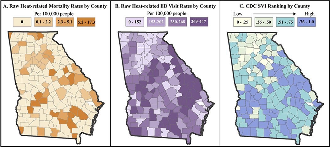
Fig. 1.
Distribution Maps of Heat-Related Mortality Raw Rates, ED Visit Rates, SVI (2002–2008). The first two maps provide spatial context for heat-related mortality and ED visit rates across Georgia, while the third map provides spatial context for social vulnerability across Georgia. Visual inspection of these maps generally reveals higher rates in areas of higher social vulnerability, presenting evidence for further spatial and statistical exploration. All maps are visualized using quartile class breaks.

