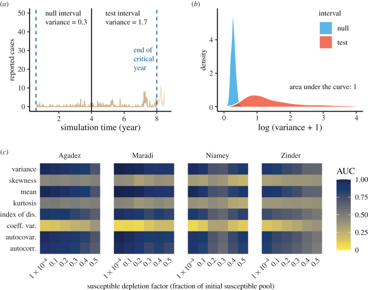
Figure 3.
Performance of early warning signals (EWS) over fixed windows on the approach to emergence. (a) A typical example of an emergence simulation for Maradi. The two vertical blue lines indicate the start (left-most line) and end (line for critical year) of the full window. The black line demarcates the division between the equal-length null and test intervals, in which we show the calculated variance. (b) Empirical densities of variance in the null and test intervals across 500 simulations and the associated area under the curve (AUC) statistic. (c) Heatmap of AUC statistics for each EWS at each level of susceptible depletion factor. AUC values closer to 0 or 1 indicate higher ability to distinguish among time series near and far from a critical transition. See electronic supplementary material, figure S8 for a visualization of how susceptible depletion factor maps to number of weeks in the null and test intervals.

