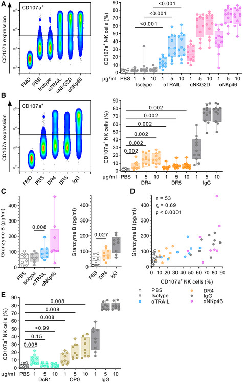
Figure 5. TRAIL engagement directly induces NK cell degranulation.

- Comparison of CD107a expression after incubation in either uncoated wells (PBS) or wells coated with αTRAIL, αNKG2D, αNKp46, or isotype using flow cytometry (n = 12 different donors per condition). Left panel: Concatenated density plot depicting CD107a expression as fluorescence intensity (y‐axis) for one representative donor and 10 µg/ml antibody concentration. Right panel: Box plots showing relative frequency of CD107a+ NK cells (y‐axis) after incubation with plate‐coated antibodies of different concentrations (x‐axis).
- Comparison of CD107a expression after incubation with plate‐coated DR4 protein, DR5 protein, or human IgG using flow cytometry (n = 11 different donors per condition). Left panel: Concatenated density plot depicting CD107a expression as fluorescence intensity (y‐axis) for one representative donor and 10 µg/ml protein concentration. Right panel: Box plots showing relative frequency of CD107a+ NK cells (y‐axis) after incubation with plate‐coated proteins of different concentrations (x‐axis).
- Comparison of granzyme B release after incubation with various stimuli (10 µg/ml each). Box plots showing granzyme B concentration in the supernatant as determined by ELISA (left panel: n = 8 different donors per condition, right panel: n = 9 different donors per condition).
- Correlation analysis between relative frequency of CD107a+ NK cells and granzyme B concentration (n = 53, data points obtained from A, B, and C, 11 different donors).
- Comparison of CD107a expression after incubation with plate‐coated DcR1 protein, osteoprotegerin (OPG), or human IgG using flow cytometry (n = 9 different donors). Box plots showing relative frequency of CD107a+ NK cells (y‐axis) after incubation with plate‐coated proteins of different concentrations (x‐axis).
Source data are available online for this figure.
