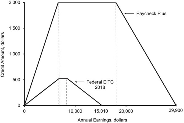
Figure 1.

Design of the Paycheck Plus Health Study, 2013–2016. The x-axis represents a given participant’s earnings from employment. The y-axis depicts the tax credit that this individual will receive upon filing income taxes. The smaller curve depicts the benefits received by the control group (the federal Earned Income Tax Credit (EITC) in 2018). The upper curve depicts the credit received by the treatment group (the Paycheck Plus evaluation). For example, a participant who earns $18,000 per year would receive no tax refund if he/she were in the control group but would receive $2,000 if he/she were in the treatment group.
