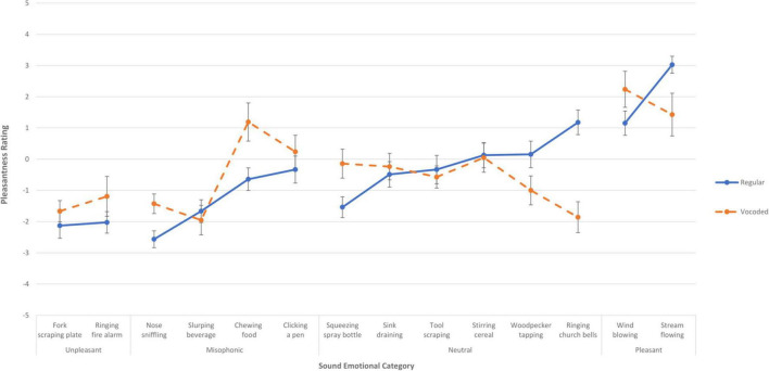
FIGURE 3.
Mean pleasantness rating for each of the fourteen sounds when presented in Experiment 1, with no vocoding (solid blue lines), and when presented in Experiment 2 as vocoded (dashed orange lines). The error bars indicate the standard error of the mean across the sounds. Each of the fourteen sounds is plotted in its a priori emotional category, with the far-left, left, right, and far-right denoting the categories of unpleasant, misophonic, neutral, and pleasant. The more pleasant a sound is rated, the higher on the y axis it is placed.

