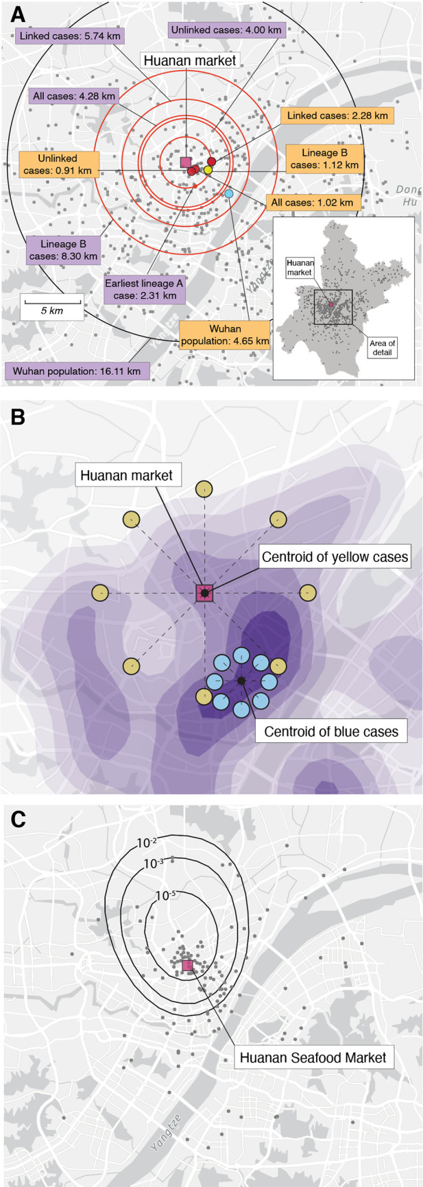
Fig. 2. Spatial analyses.

(A) Inset: map of Wuhan, with gray dots indicating 1000 random samples from worldpop.com null distribution. Main panel: median distance between Huanan market and (1) worldpop.org null distribution shown with a black circle and (2) December cases shown by red circles (distance to Huanan market depicted in purple boxes). Center-point of Wuhan population density data shown by blue dot. Center-points of December case locations shown by red dots (‘all’, ‘linked’ and ‘unlinked’ cases); dark blue dot (lineage A cases); and yellow dot (lineage B cases). Distance from center-points to Huanan market depicted in orange boxes. (B) Schematic showing how cases can be near to, but not centered on, a specific location. We hypothesized that if the Huanan market epicenter of the pandemic then early cases should fall not just unexpectedly near to it but should also be unexpectedly centered on it (see Methods). The blue cases show how cases quite near the Huanan market could nevertheless not be centered on it. (C) Tolerance contours based on relative risk of COVID-19 cases in December, 2019 versus data from January-February 2020. The dots show the December case locations. The contours represent the probability of observing that density of December cases within the bounds of the given contour if the December cases had been drawn from the same spatial distribution as the January-February data.
