. 2022 Aug 3;11:e78129. doi: 10.7554/eLife.78129

Figure 1. Plankton biogeography, environmental variation, and ocean transport among Tara Oceans stations.

Major currents are represented by solid arrows. (a) Genomic provinces of Tara Oceans surface samples for the 0.8–5 µm size fraction, each labeled with a letter prefix (‘C’ represents the 0.8–5 µm size fraction) and a number; samples not assigned to a genomic province are labeled with ‘-’. Maps of all six size fractions and including deep chlorophyll maximum samples are available in Figure 1—figure supplement 4. Station colors are derived from an ordination of metagenomic dissimilarities; more dissimilar colors indicate more dissimilar communities (see Materials and methods). (b) Stations colored based on an ordination of temperature and the ratio of NO3 + NO2 to PO4 (replaced by 10−6 for three stations where the measurement of PO4 was 0) and of NO3 + NO2 to Fe. Colors do not correspond directly between maps; however, the geographical partitioning among stations is similar between the two maps. (c) Simulated trajectories corresponding to the minimum travel time (Tmin) for pairs of stations (black dots) connected by Tmin <1.5 years. Directionality of trajectories is not represented.

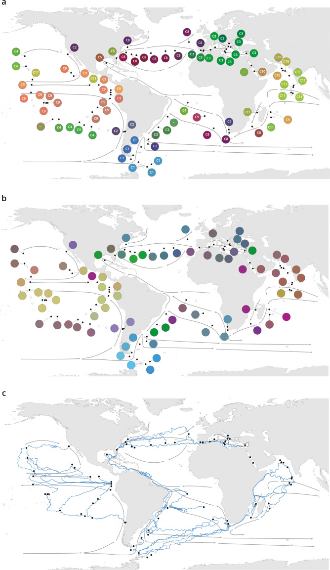
Figure 1.

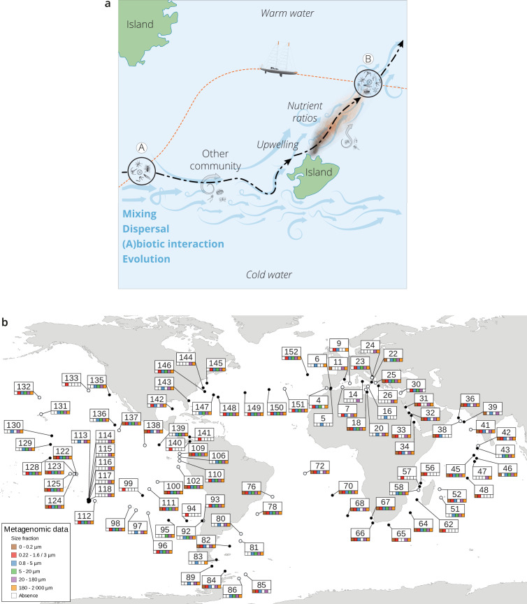
Figure 1—figure supplement 1. The seascape, plankton transport, and community metagenomic samples of Tara Oceans stations.

Figure 1—figure supplement 1.

(a) A community sampled at a given location A changes over time as it travels along ocean currents (dashed bold line) to a second location B. It is affected by numerous external processes, including mixing with water containing other communities and changes in local nutrient concentration, and by internal processes, such as biotic interactions. In this study, the Tara schooner followed a sampling route (orange dashed line) leading to an elapsed time between the two sampling sites A and B that was independent of plankton travel time. (b) Location, station number, and sequenced surface metagenomic samples. For the stations indicated with a hollow circle, there was a greater than 0.5°C difference in temperature between surface and deep chlorophyll maximum (DCM); those indicated with a full circle had a difference in temperature less than or equal to 0.5°C or did not have samples sequenced for both the surface and DCM.

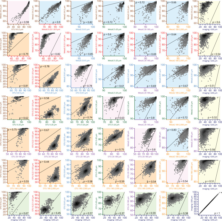
Figure 1—figure supplement 2. Scatter plots comparing β-diversity estimates from metagenomic, operational taxonomic unit (OTU)-based, and imaging-based dissimilarity.

Figure 1—figure supplement 2.

Source data for comparisons are indicated on the axes of each plot (axis colors correspond to size fractions or imaging data as in other figures, e.g., Figure 3—figure supplement 1). Axes are not necessarily drawn on the same scales; the identity line is indicated on each plot to help interpret the relationship between axes. Plots with a pink background are comparisons of metagenomic versus OTU-based dissimilarity within the same size fraction. Plots with a blue background are comparisons of metagenomic dissimilarity among size fractions, and those with an orange background compare OTU-based dissimilarity among size fractions. Plots with a yellow or green background compare imaging-based dissimilarity to either metagenomic or OTU-based dissimilarity, respectively. Each point within a plot represents a pairwise comparison of β-diversity estimates between two Tara Oceans samples. Rank-based correlations (Spearman, p≤10−4) are indicated in each plot.

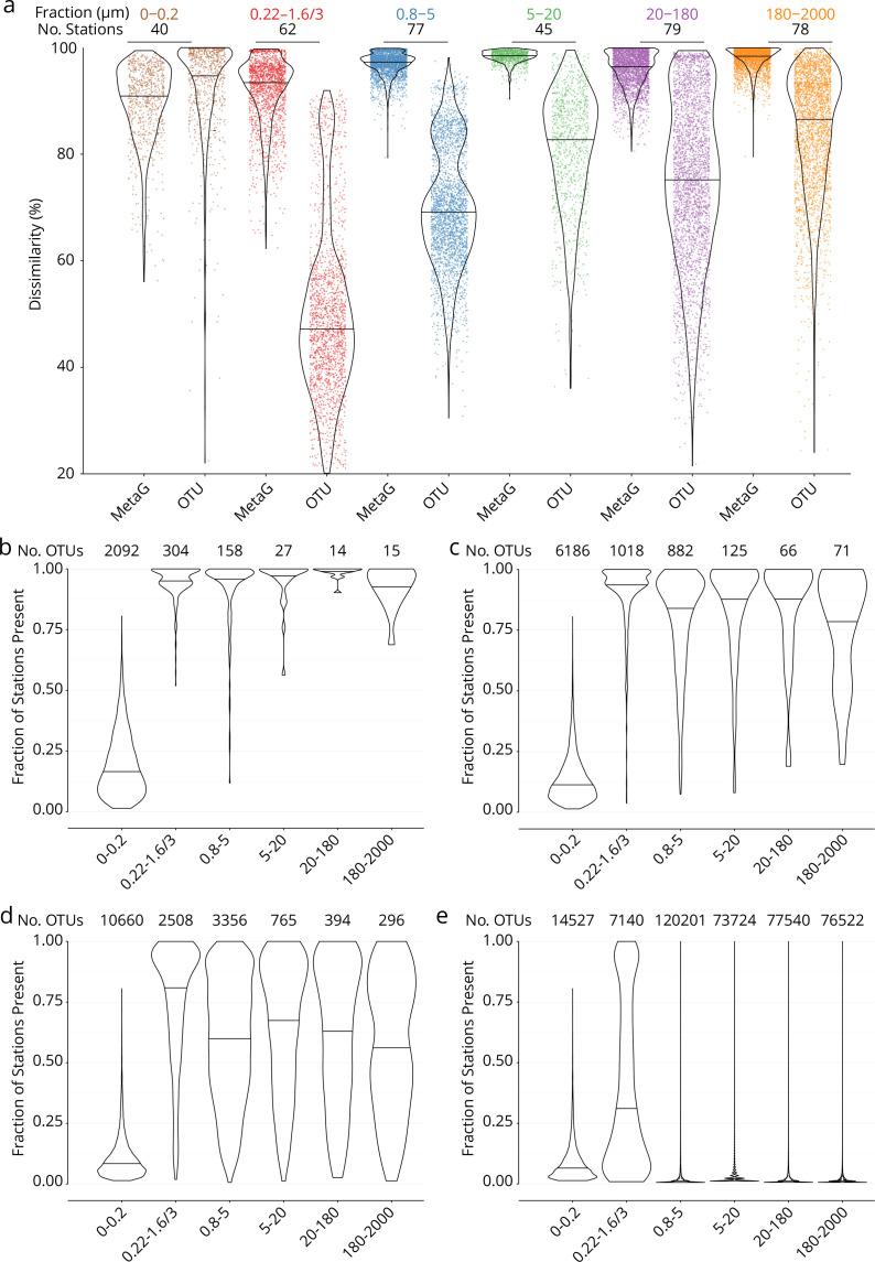
Figure 1—figure supplement 3. Global dissimilarity and operational taxonomic unit (OTU) occupancy.

Figure 1—figure supplement 3.

(a) Distributions of dissimilarity for six organismal size fractions (measured either as metagenomic or OTU dissimilarity; see Appendix 1). One colored point represents one pair of stations. Violin plots (horizontal line: median) summarize each distribution. The number of stations in common between the metagenomic/OTU data sets within each size fraction is indicated above. (b–e) OTU occupancy for different proportions of total abundance. Fraction of stations present (occupancy) for the minimum number of OTUs (indicated above) necessary to represent different proportions of the total abundance within each organismal size fraction. A relatively small number of abundant and cosmopolitan taxa represents the majority of the abundance within each size fraction; this effect is more pronounced with increasing organismal size. (b) OTUs representing 50% of the total abundance within each size fraction. (c) 80%. (d) 95%. (e) 100% (all OTUs).

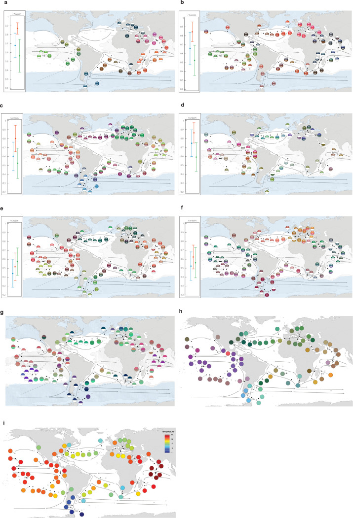
Figure 1—figure supplement 4. Genomic provinces in comparison to previous ocean divisions and to metagenome-assembled genome (MAG) abundance variation, and ordination maps of environmental parameters.

Figure 1—figure supplement 4.

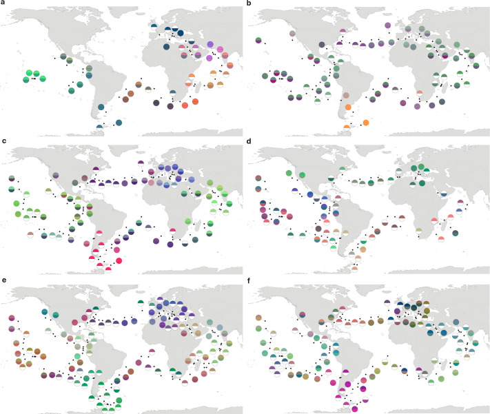
Colors are based on principal coordinates analysis-RGB (Methods) and do not correspond directly among maps. (a–f) Geographical maps of genomic provinces by organismal size fraction (see Appendix 2). Circles denote stations with data available for the size fraction and contain the corresponding genomic province identifiers (one letter prefix per size fraction [A–F]; stations not assigned to genomic provinces are shown as ‘-’). The top portion of each circle represents samples collected at the surface and the bottom portion represents the deep chlorophyll maximum (stations missing metagenomic data for one of the two depths are drawn as half circles). Major currents are shown with solid black arrows, wind transport with dashed gray arrows. Blue zones indicate temperature <14°C. Hashed zones indicate phosphate concentration >0.4 mmol. Hierarchical dendrograms that were used to build genomic provinces are shown in Figure 1—figure supplement 6. Maps with colors based on operational taxonomic unit dissimilarity are shown in Figure 1—figure supplement 5. (a) ‘A’ prefix, 0–0.2 µm size fraction. (b) ‘B’ prefix, 0.22–1.6/3 µm. (c) ‘C’ prefix, 0.8–5 µm. (d) ‘D’ prefix, 5–20 µm. (e) ‘E’ prefix, 20–180 µm. (f), ‘F’ prefix, 180–2000 µm. Insets, Results of ANOSIM to determine, independently for each size fraction, the ability of three nested levels of ocean partitioning to explain metagenomic dissimilarities among stations (blue, Longhurst biomes; red, Longhurst biogeochemical provinces; green, Oliver and Irwin objective provinces; see Materials and methods and Appendix 3). (g) Geographical map for the 20–180 µm size fraction, for comparison with panel (e) generated from MAG dissimilarity among stations. (h) The distribution of temperature and nutrient variations matches the biogeography of small plankton (<20 µm). Stations are colored based on an ordination of Euclidean distances in temperature, NO3 + NO2, PO4, and Fe. (i) The distribution of temperature matches the biogeography of large plankton (>20 µm). Stations are colored following a Box-Cox transformation (Methods).

Figure 1—figure supplement 5. Biogeography based on an ordination of operational taxonomic unit (OTU) dissimilarity.

Figure 1—figure supplement 5.

(a–f) Principal coordinates analysis-RGB color maps for OTUs (see Materials and methods). The top of each half circle represents samples collected at the surface and the bottom portion represents the deep chlorophyll maximum (stations missing OTU data for one of the two depths are drawn as half circles). Station colors do not correspond among size fractions. (a) 0–0.2 µm size fraction. (b) 0.22–1.6/3 µm. (c) 0.8–5 µm. (d) 5–20 µm. (e) 20–180 µm. (f) 180–2000 µm.

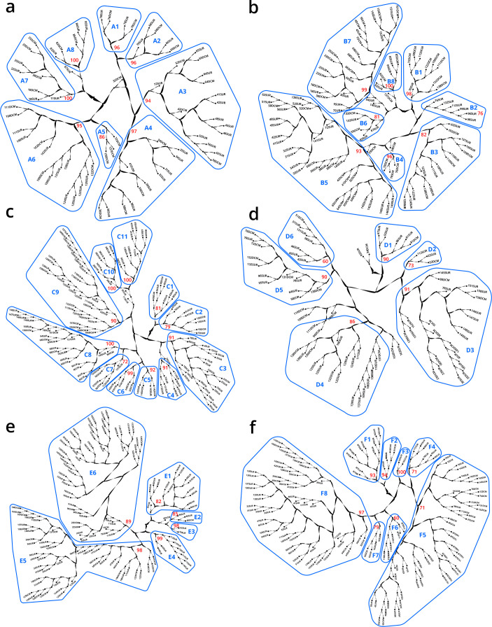
Figure 1—figure supplement 6. Hierarchical trees illustrating how samples were partitioned into genomic provinces.

Figure 1—figure supplement 6.

Dendrograms resulted from unweighted pair group method with arithmetic mean clustering. Each sample (SUR: surface, DCM: deep chlorophyll maximum) is shown as a leaf. Genomic provinces are shown with their identifiers in blue polygons; identifiers are composed of one letter prefix per size fraction (A–F) and a number. Bootstrap values in red show the support at the key nodes that separate genomic provinces from one another. See also Appendix 2 on the robustness of genomic provinces. (a) ‘A’ prefix, 0–0.2 µm size fraction. (b) ‘B’ prefix, 0.22–1.6/3 µm. (c) ‘C’ prefix, 0.8–5 µm. (d) ‘D’ prefix, 5–20 µm. (e) ‘E’ prefix, 20–180 µm. (f) ‘F’ prefix, 180–2000 µm.

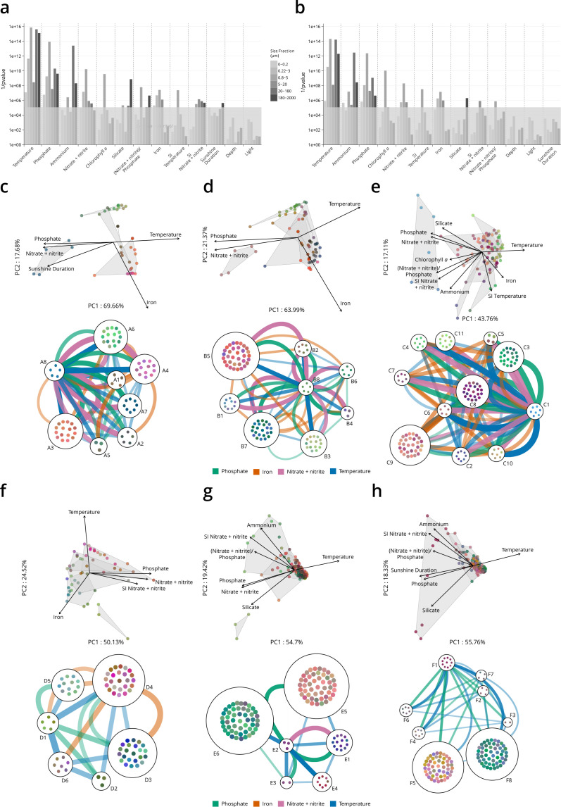
Figure 1—figure supplement 7. Environmental parameters that distinguish genomic provinces.

Figure 1—figure supplement 7.

(a–b) Environmental parameters that significantly differentiate among genomic provinces (Kruskal-Wallis test, gray box indicates p values >10−5). SI: seasonality index. (a) All stations. (b) Antarctic stations removed (see Materials and methods). Eliminating Antarctic stations does not result in a large change in the parameters that significantly differentiate among provinces. (c–h) Two types of visualizations of the relationships between genomic provinces and environmental parameters. Sample colors are those from Figure 1—figure supplement 4a-f. Top plots within panels (c–h): principal components analysis-based visualization. Samples and environmental parameters differing significantly (p≤10−5) among genomic provinces, are projected onto the first two axes of variation. Gray polygons enclose different genomic provinces. Bottom plots within panels (c–h): network-based visualization. Each genomic province is represented as a node, with the individual samples composing the province within the node. Edges between nodes represent differences in temperature, nitrate + nitrite, phosphate, and iron that significantly differentiate (p≤10−5) among genomic provinces, that are statistically significantly different between individual pairs of genomic provinces (post hoc Tukey test, p<0.01) and whose difference in median parameter values is ≥1 SD (calculated from the parameter values of all samples in the size fraction). Thicker edges represent larger differences. (c) 0–0.2 µm size fraction. (d) 0.22–1.6/3 µm. (e) 0.8–5 µm. (f) 5–20 µm. (g) 20–180 µm. (h) 180–2000 µm.