
Figure 1.
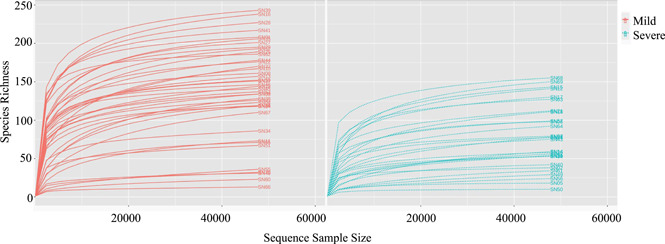
The rarefaction curves between the mild group and severe group. A curve represents a sample. The x‐axis indicates the number of clean reads randomly selected from a sample, and the y‐axis represents the species richness. Words "SN" plus a number indicates a specific sample.